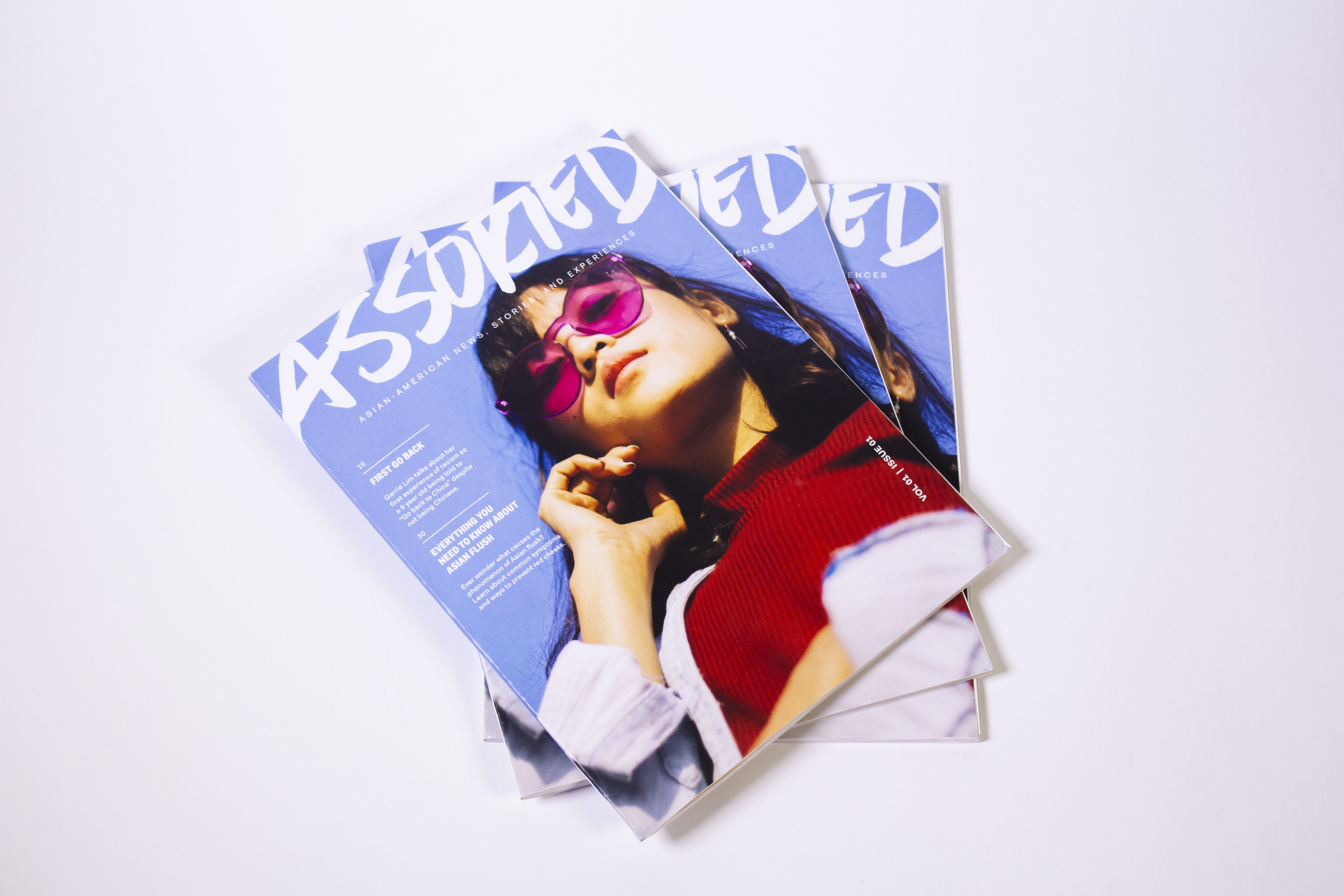
Assorted
Print Design | Branding | Spring 2019
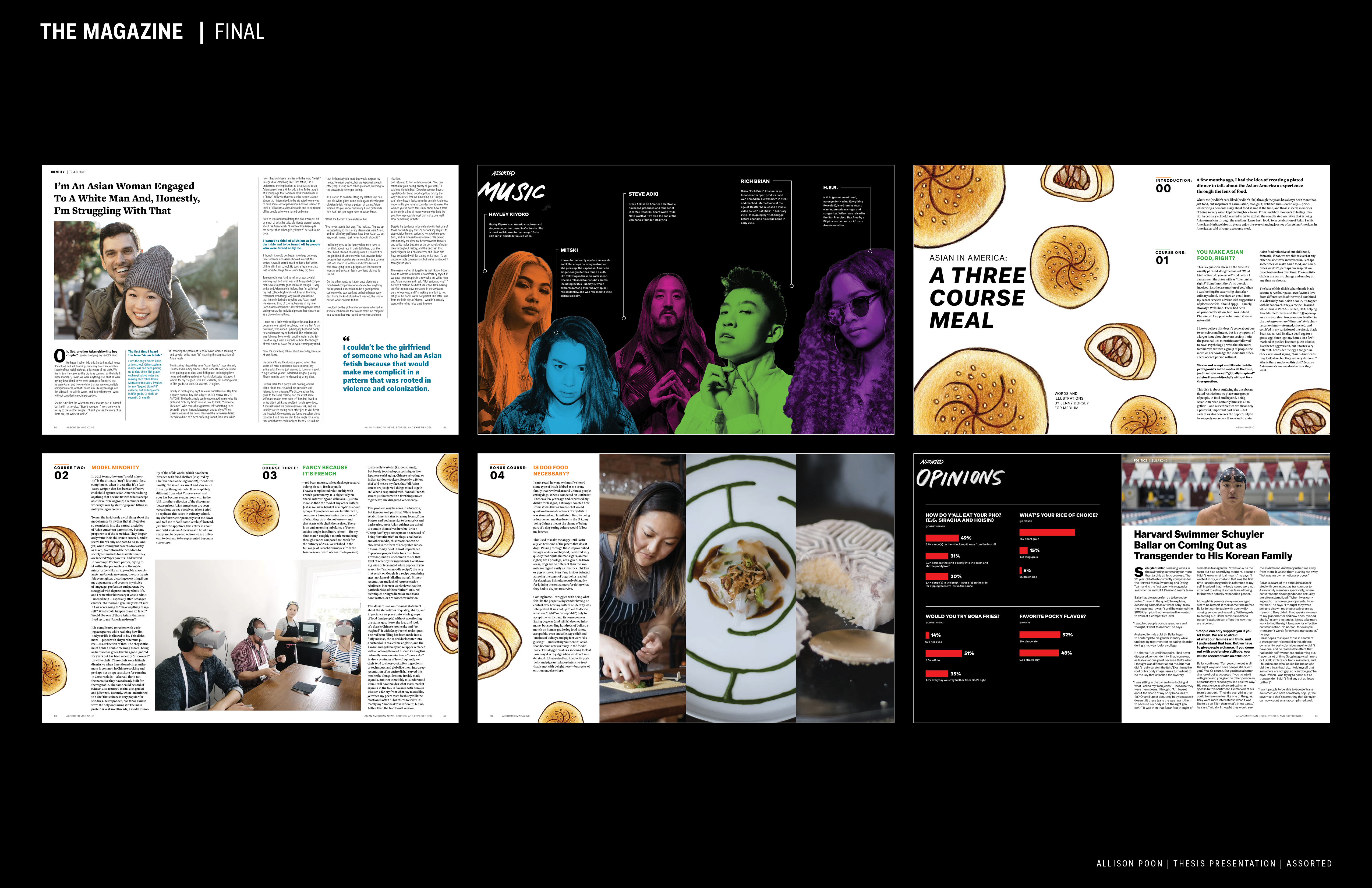
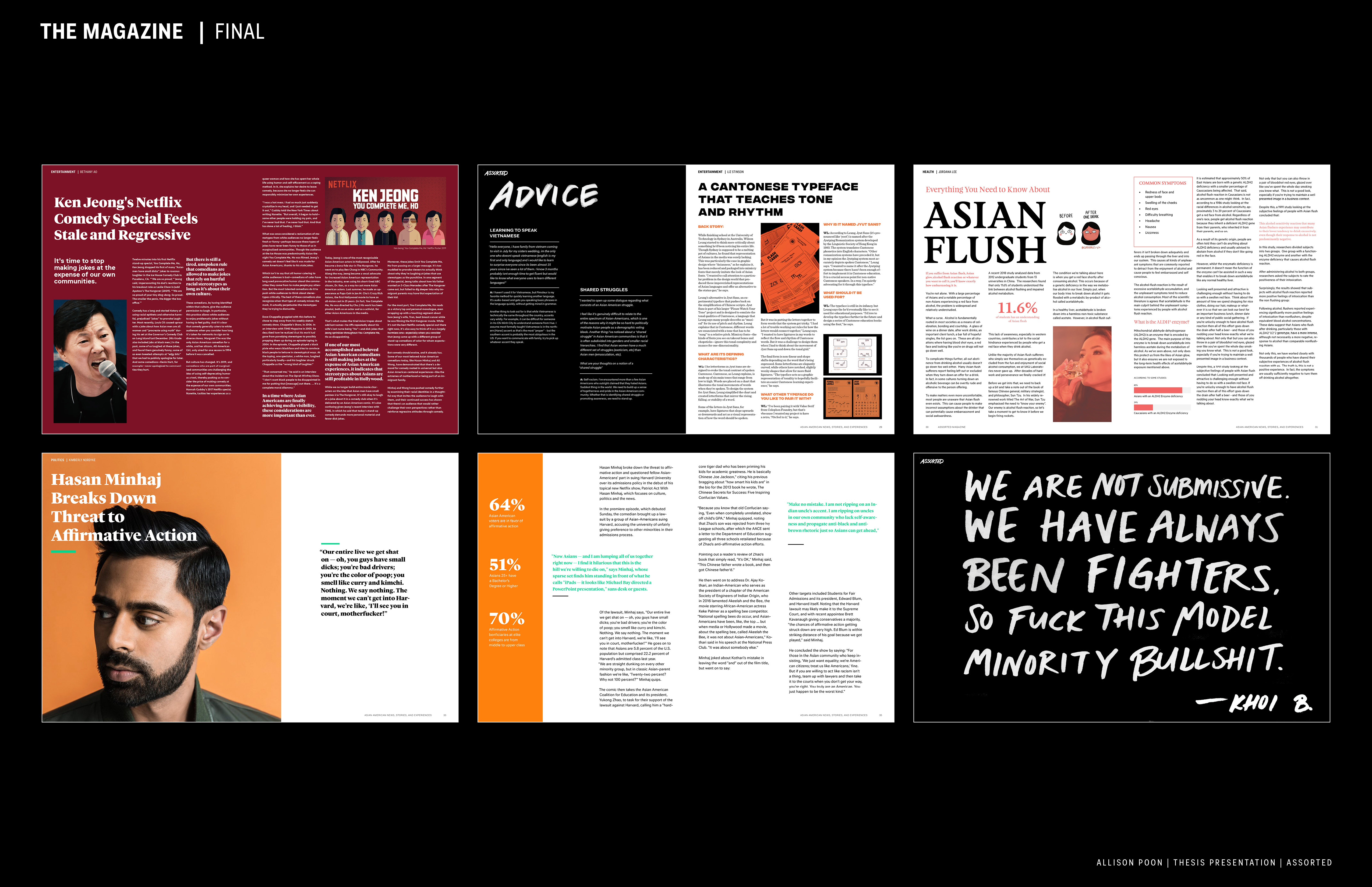
ASSORTED is a magazine to help create a community and space for Asian Americans to share stories and discuss their struggles. Through print (and digital coming soon!), ASSORTED is a tool used to help Asian-Americans reaffirm their identity and culture.
Programs used: InDesign, Photoshop, Sketch
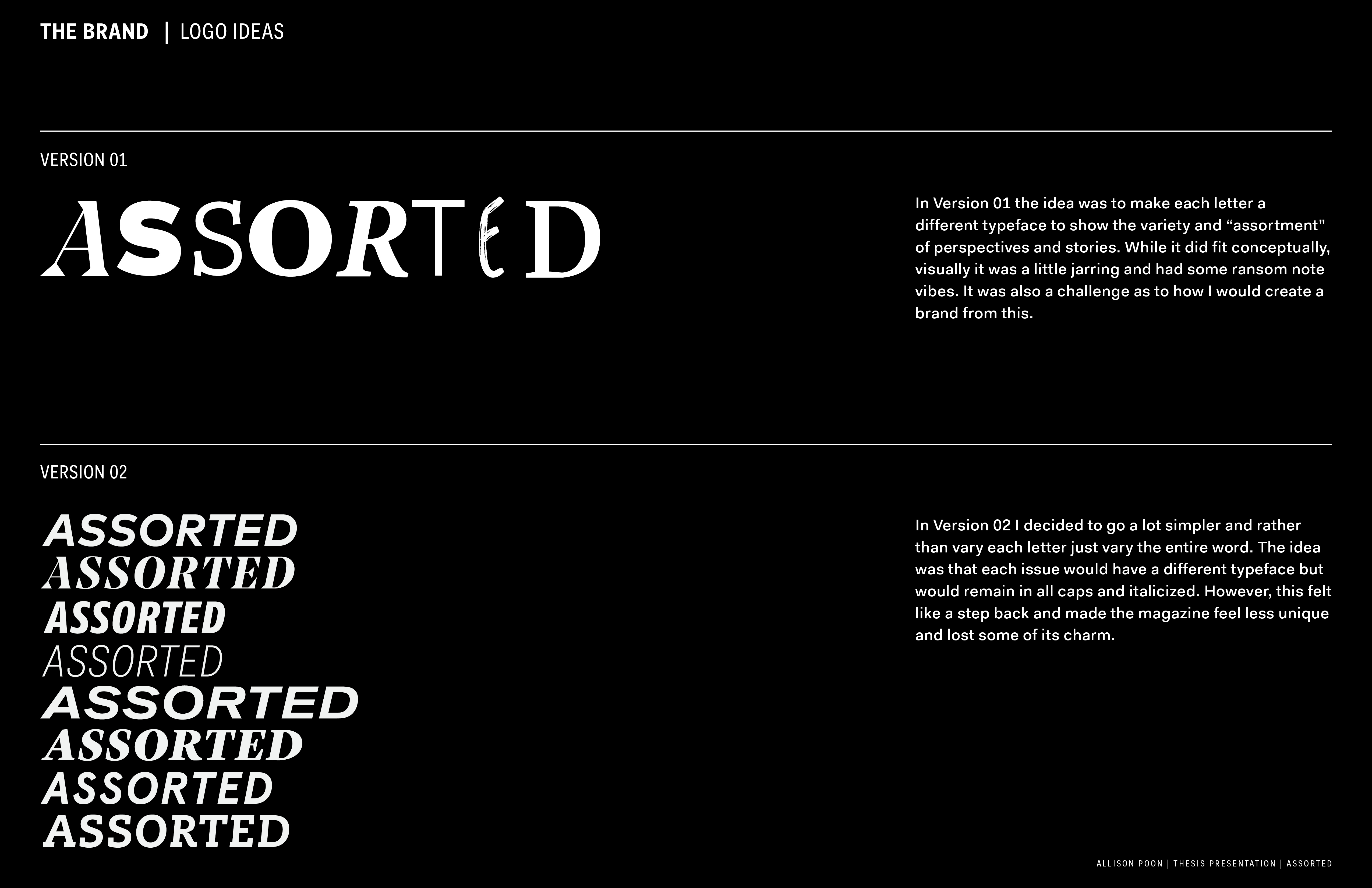
Figuring Out the Brand
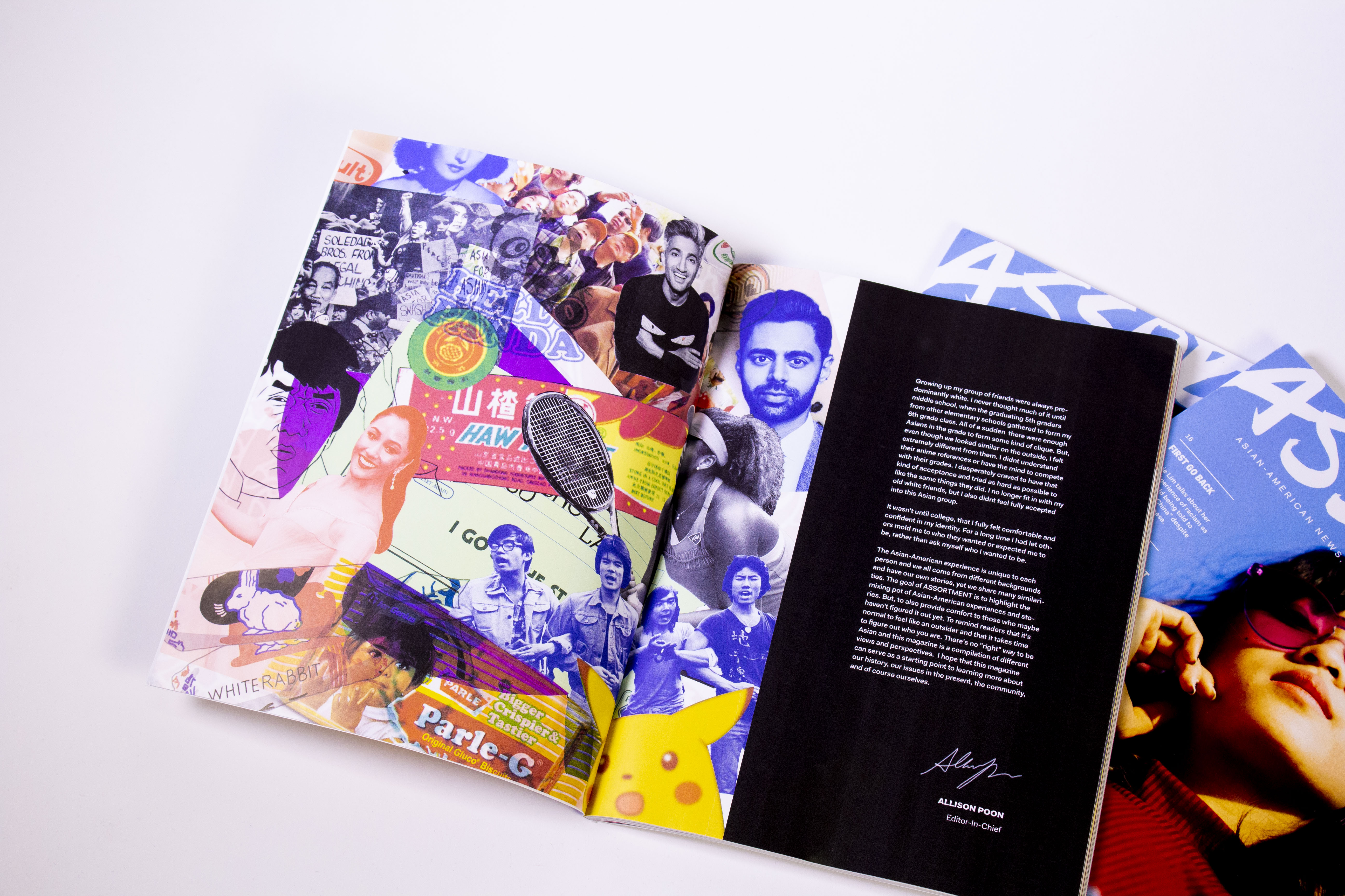
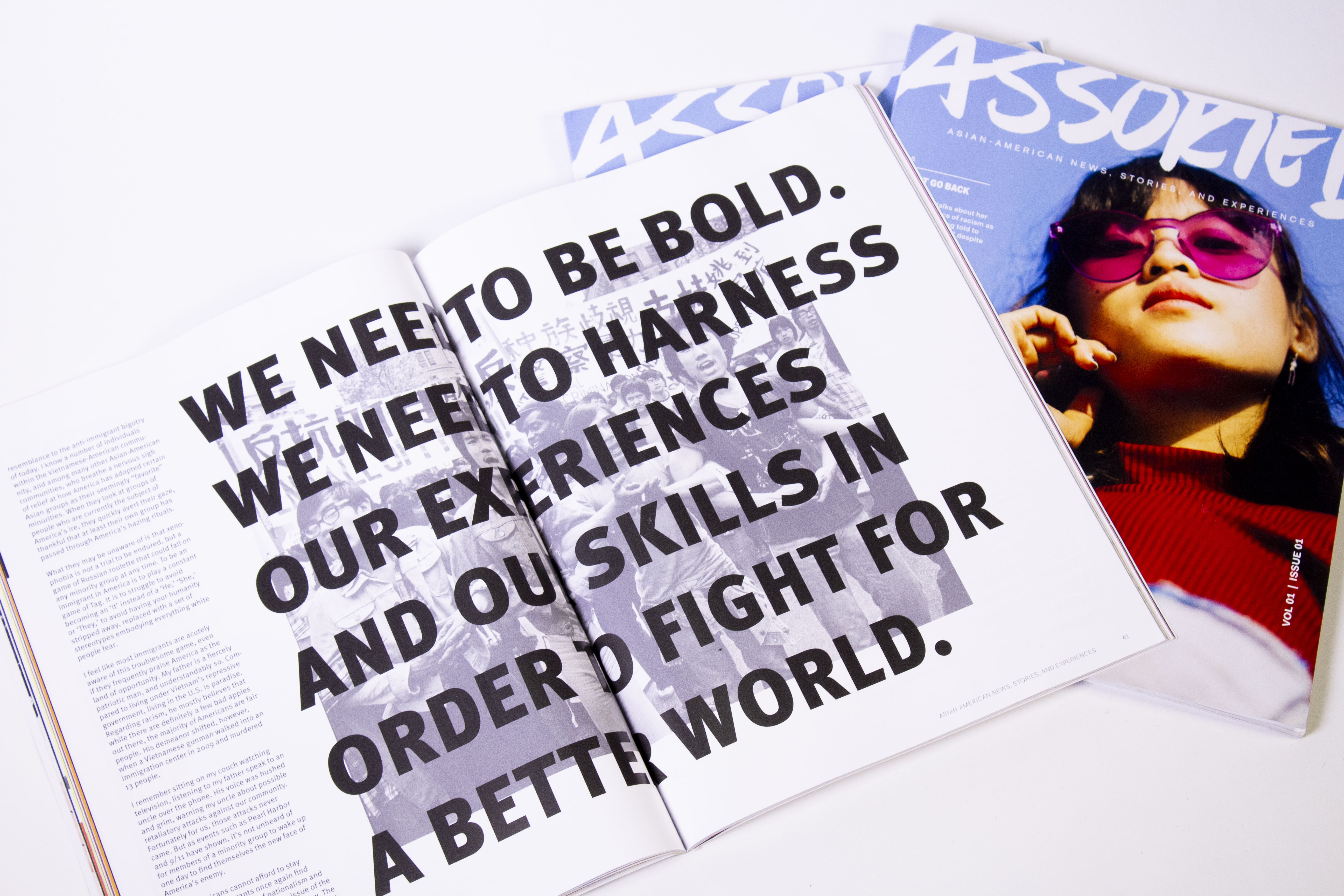
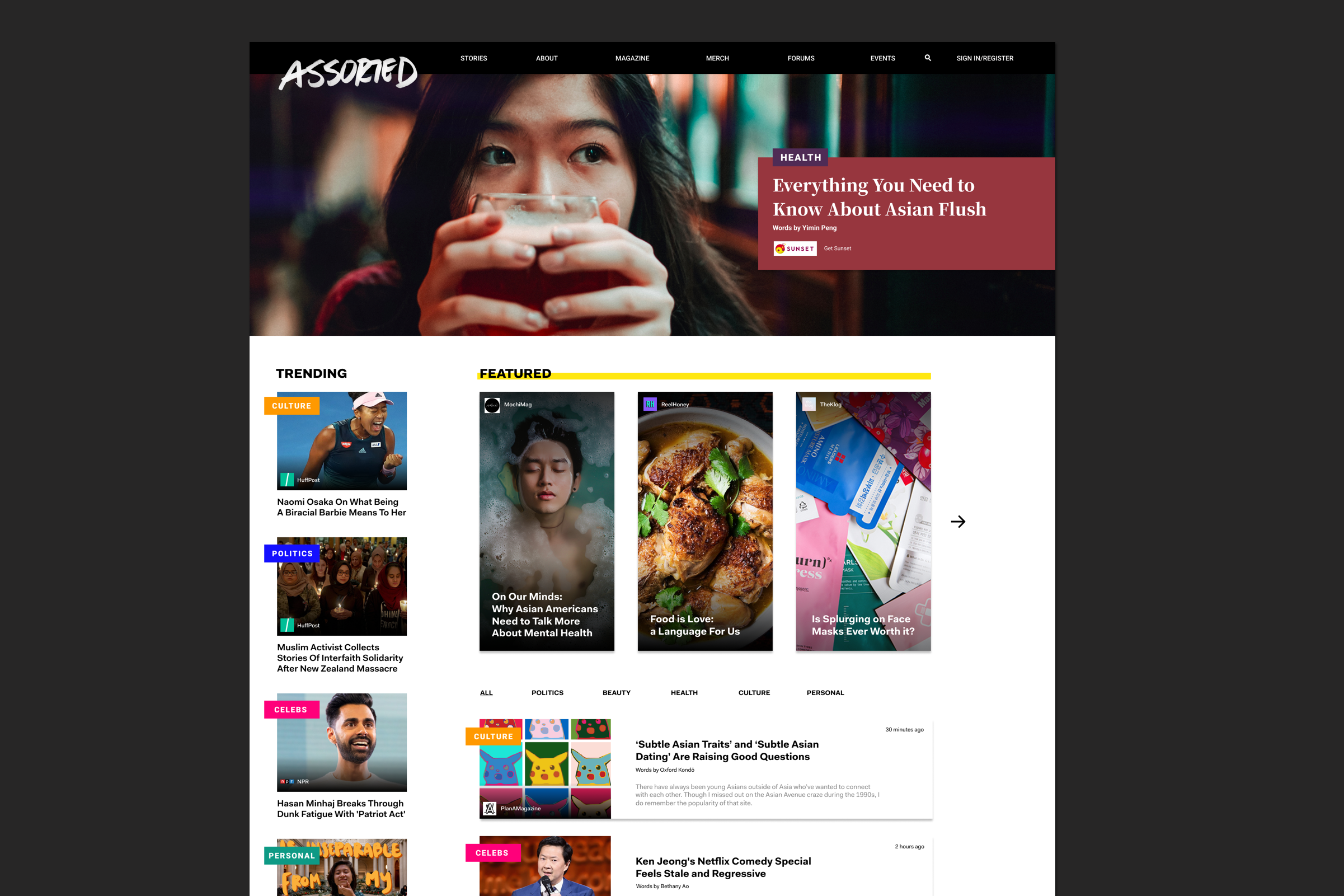
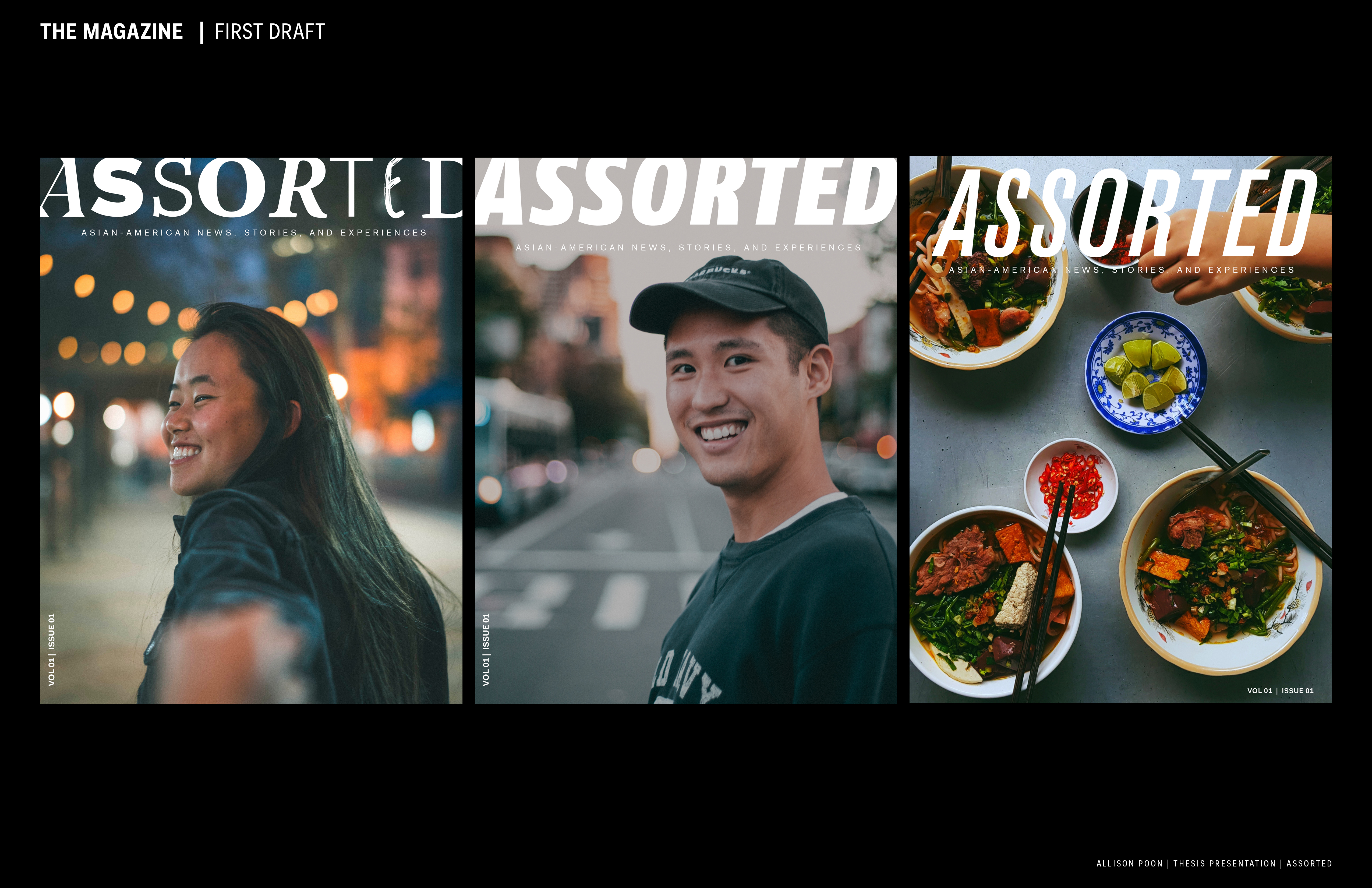
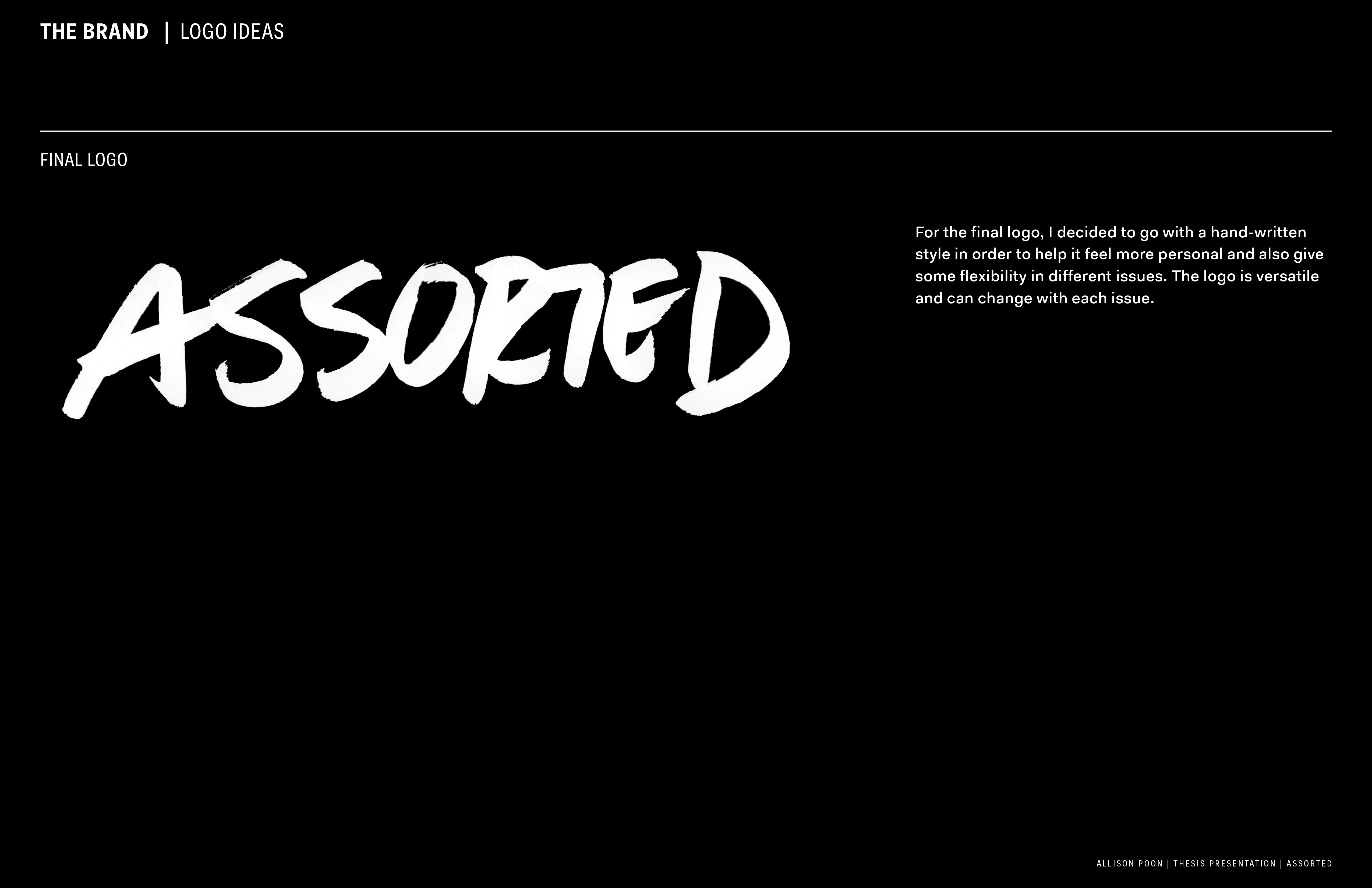
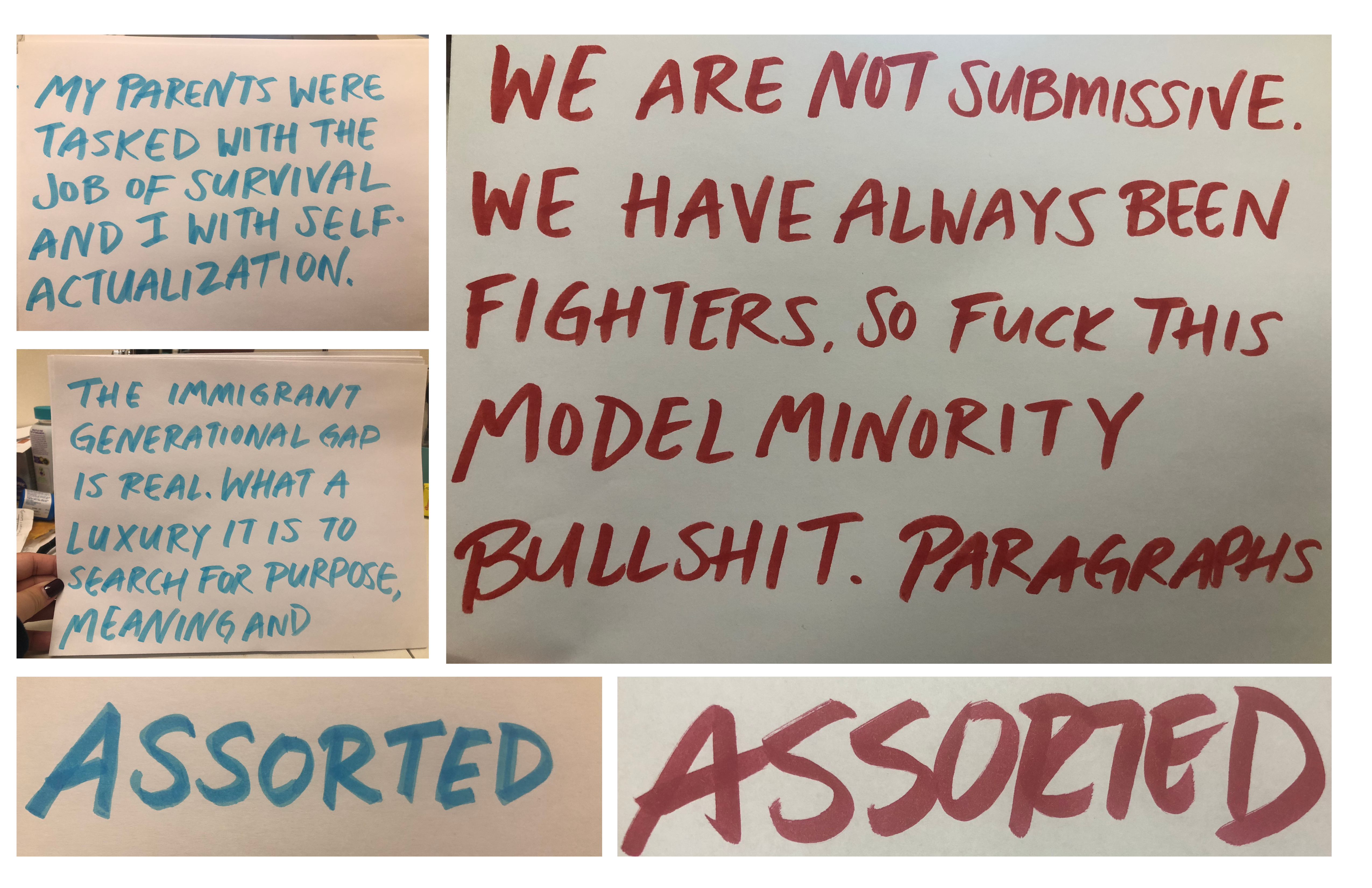
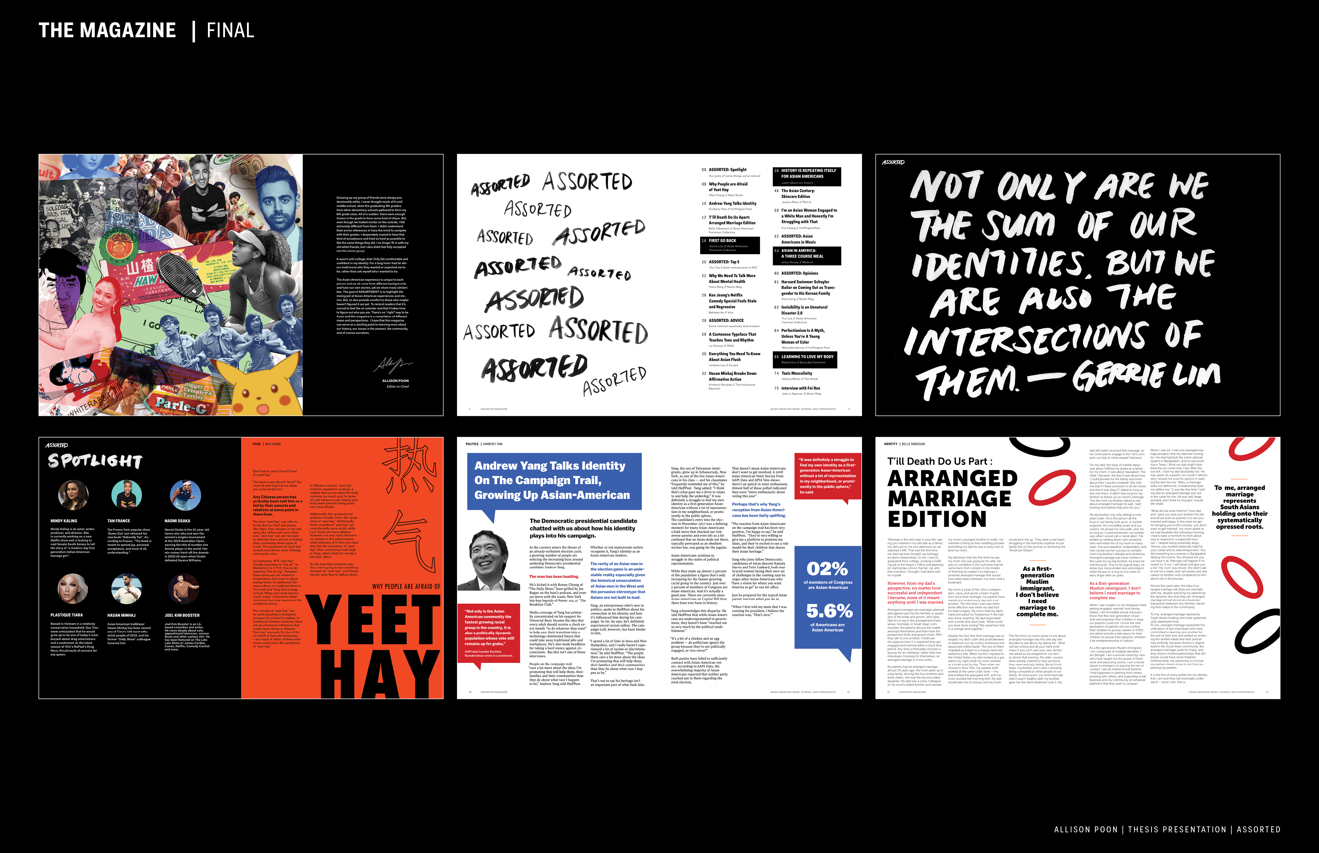
From the start of this project, I knew that this was a daunting task. How can I create an experience that is specific enough to relate to but inclusive enough that people don’t feel left out? I fell on this idea of “assortment” and how despite being from the same cultural background we often have a variation of experiences. I really wanted to focus on this idea of Asian-American identity and be able to showcase different personalities and stories, not just one archetype that we’re often boxed into. So, I decided that along with this idea of “assortment” that each story has it’s own color and it’s own voice. I wanted to highlight that message through design and so I set out on a daunting challenge to somehow create a brand out of this variation, to somehow make this feel like one cohesive thing, but also give each story it’s own color.
From the start of this project, I knew that this was a daunting task. How can I create an experience that is specific enough to relate to but inclusive enough that people don’t feel left out? I fell on this idea of “assortment” and how despite being from the same cultural background we often have a variation of experiences. I really wanted to focus on this idea of Asian-American identity and be able to showcase different personalities and stories, not just one archetype that we’re often boxed into. So, I decided that along with this idea of “assortment” that each story has it’s own color and it’s own voice. I wanted to highlight that message through design and so I set out on a daunting challenge to somehow create a brand out of this variation, to somehow make this feel like one cohesive thing, but also give each story it’s own color.
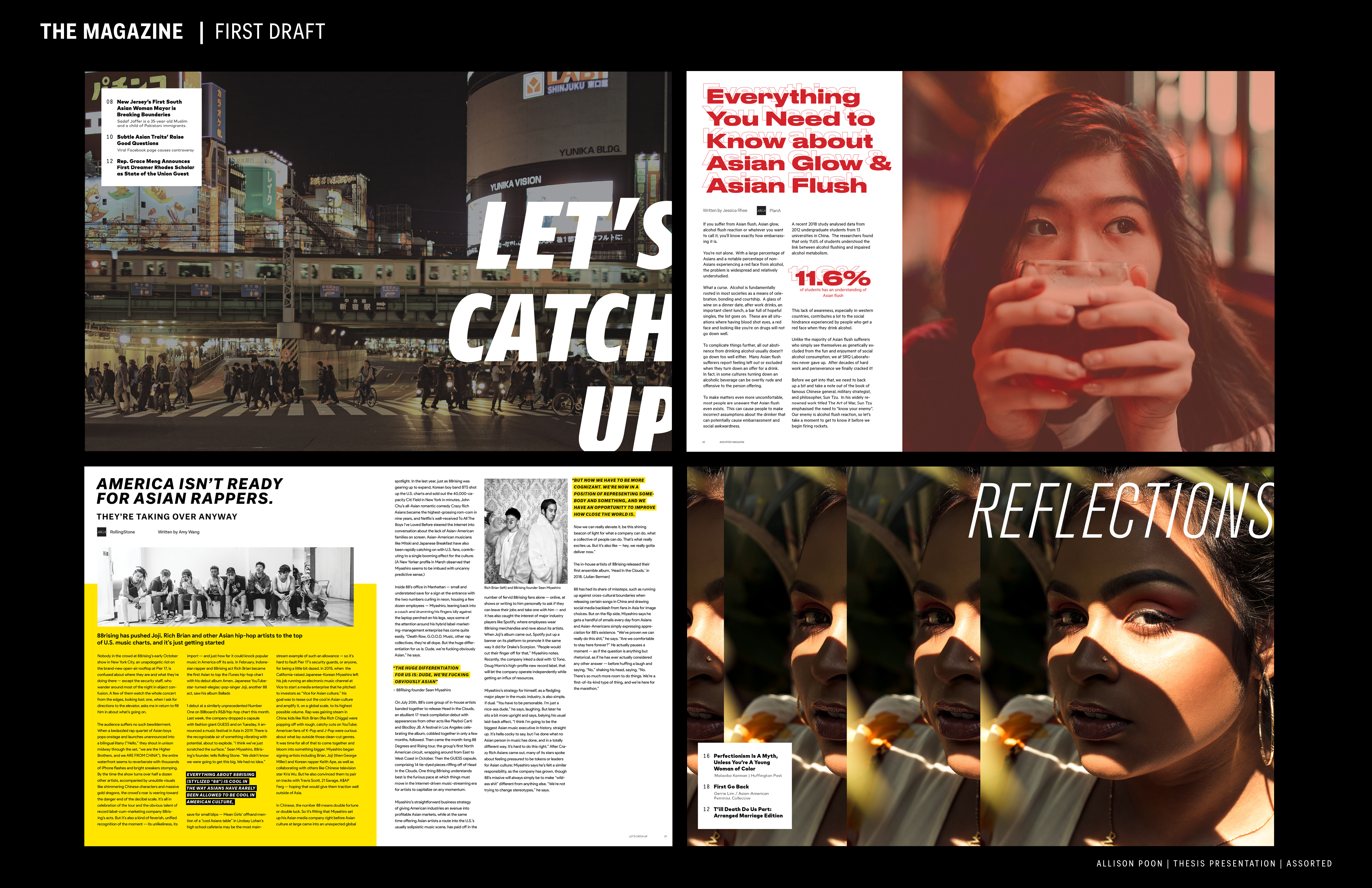
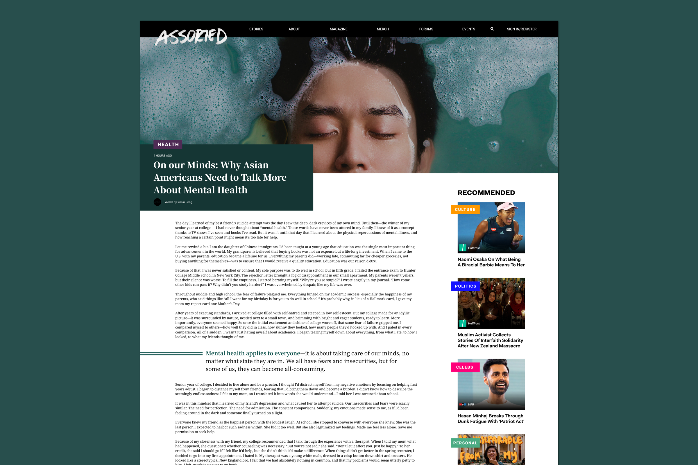
Building Out the Pages
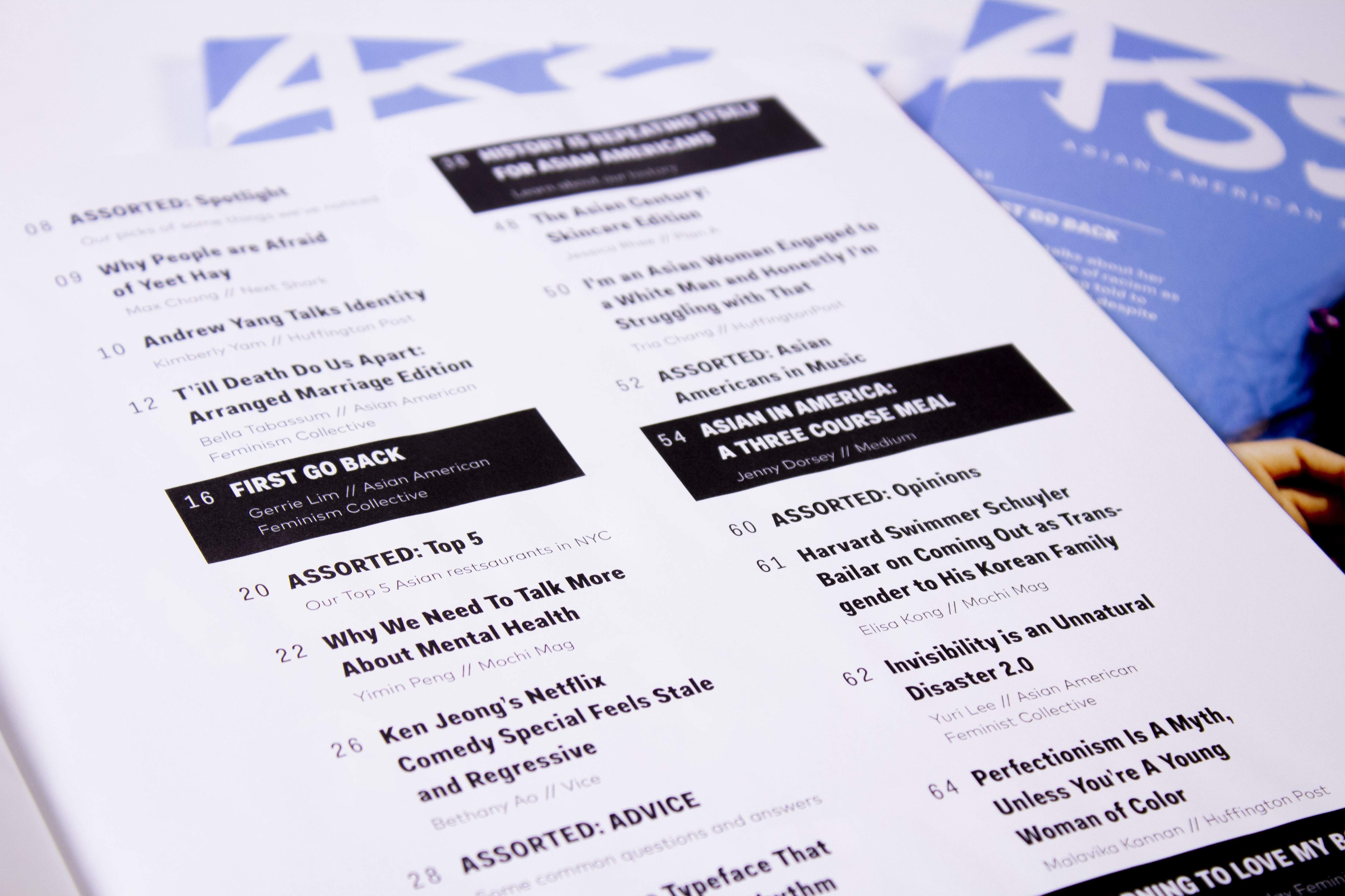
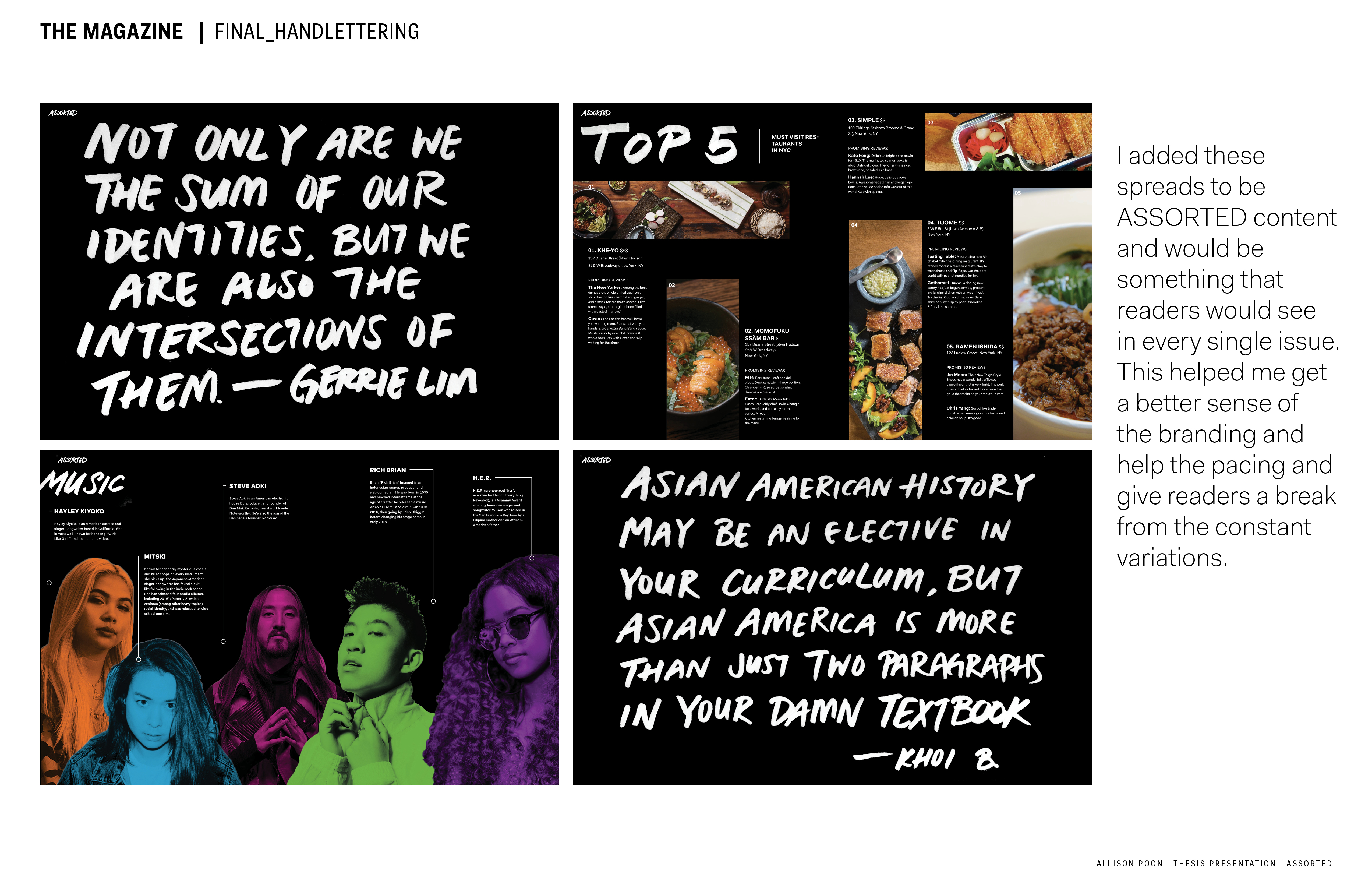
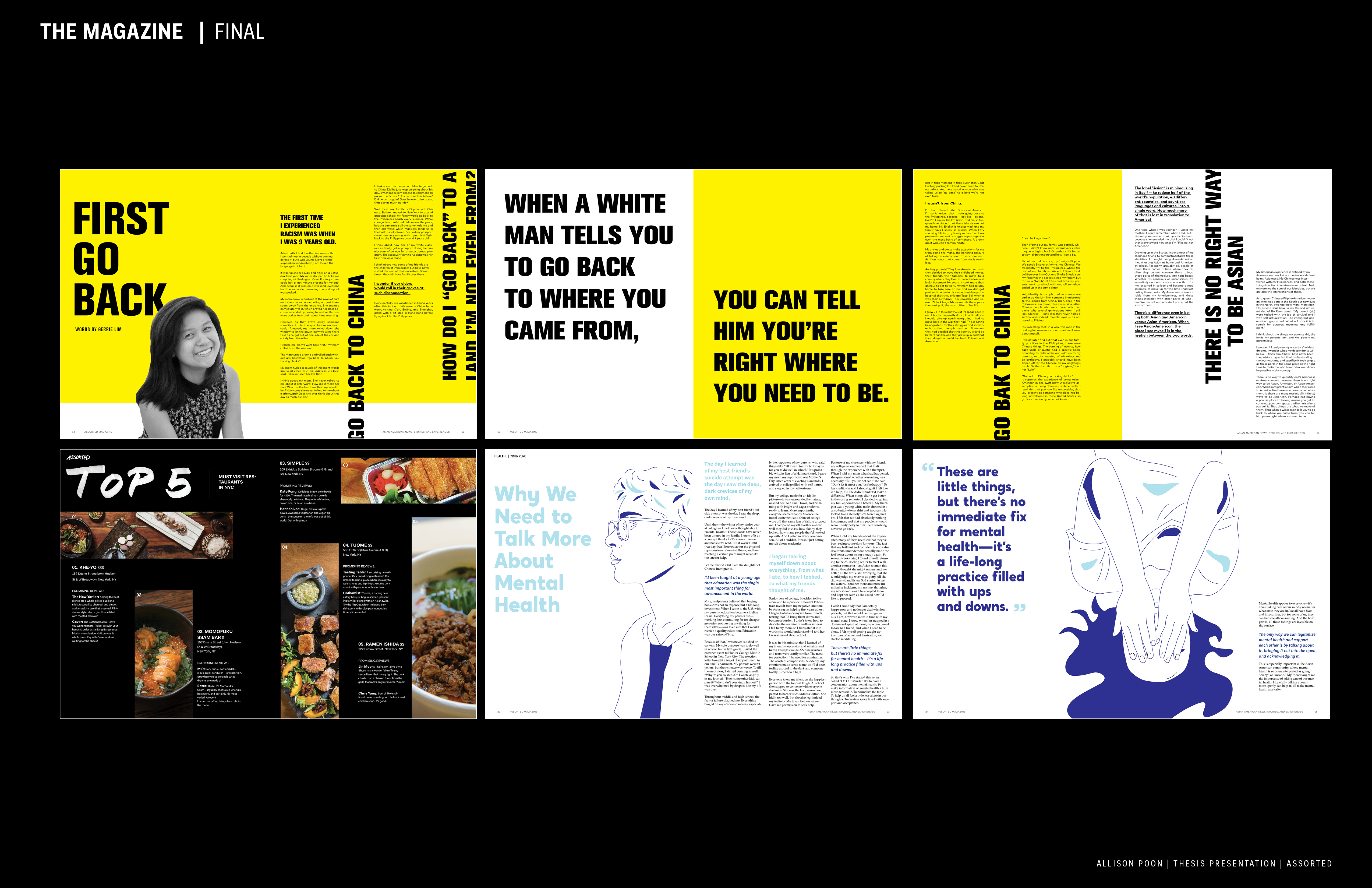
It was definitely a struggle to juggle so many different stories and a lot of them ended up being cut from the final, mostly so that I wouldn’t be so overwhelmed within the time frame that I was given. It was a challenge to get back into the mindset of print design and I learned a lot in terms of utilizing the grid and how important little details are when it comes to typography.
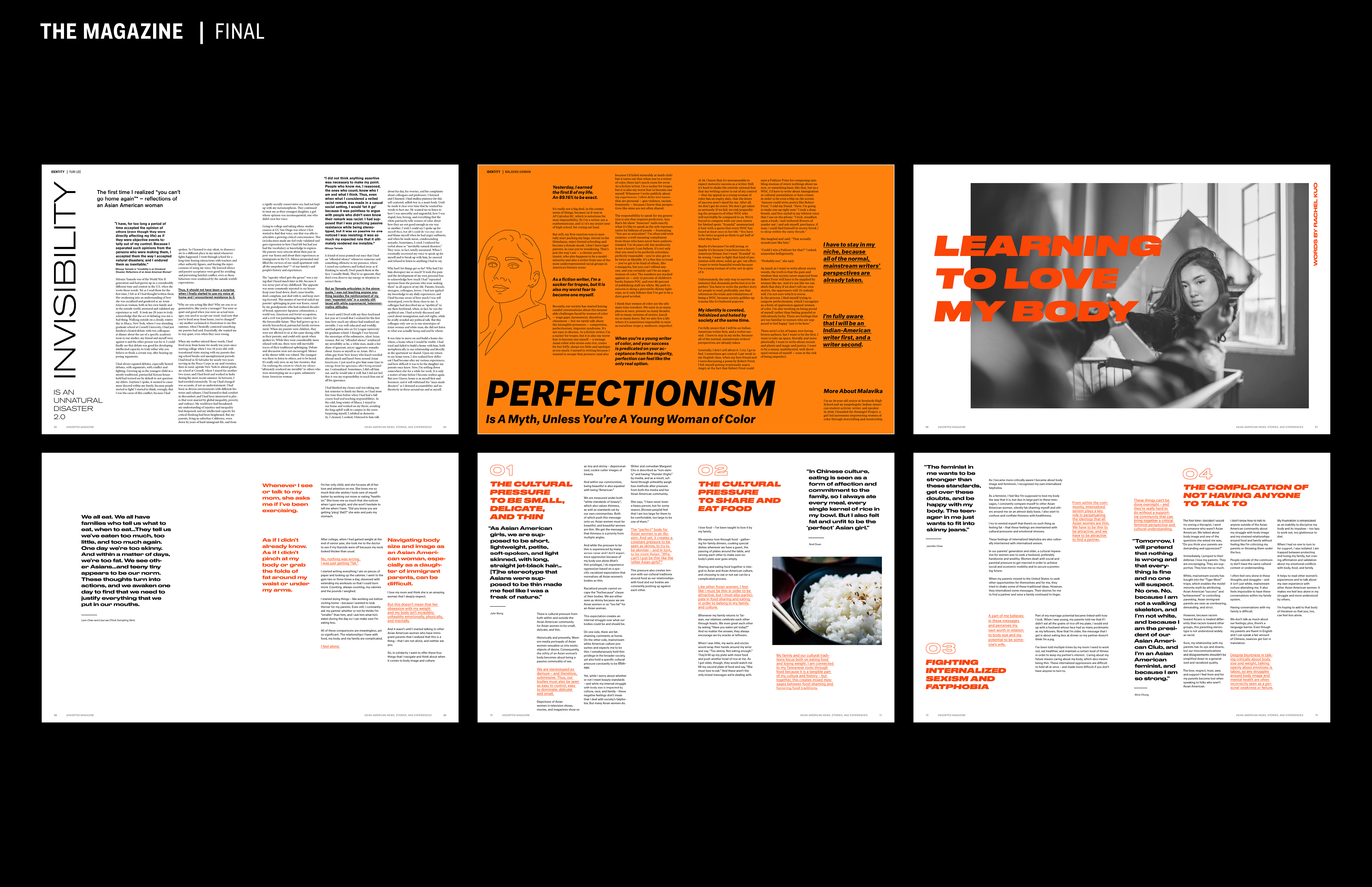
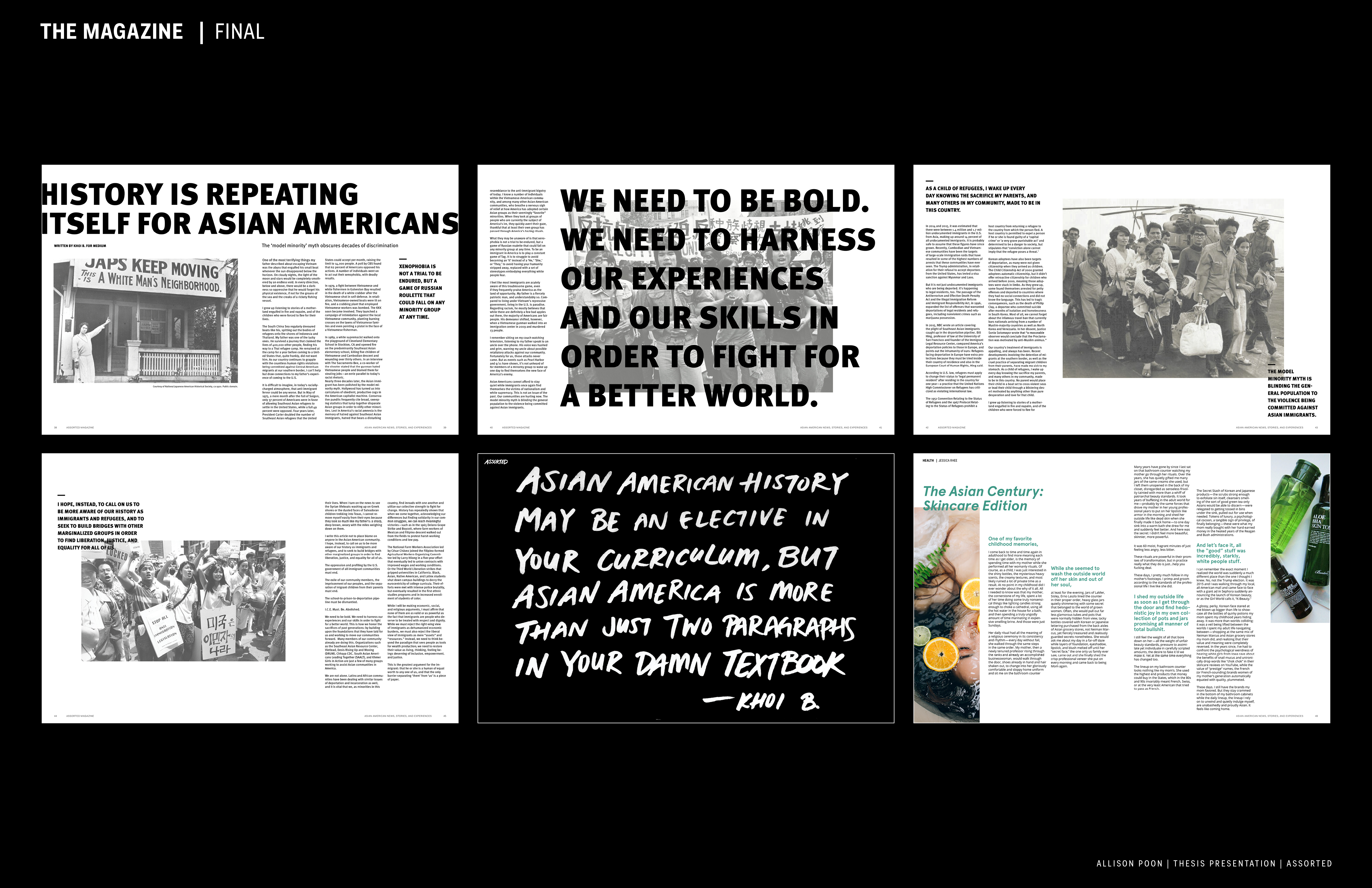
Final Form